

In this blog post, we will explore how to create custom charts in PowerApps using the PowerApps Component Framework (PCF). PCF allows developers to build fully customizable controls for PowerApps, which can be used to enhance data visualization and user interaction. We’ll create a custom chart control and explain how it works without delving into the technical details or code.
Creating Custom Charts with PCF
PowerApps Component Framework (PCF) enables us to build custom controls, including charts, that can be seamlessly integrated into PowerApps. These controls can be used to display data in various formats, making it easier to understand and analyze information. Let’s see how to create a custom chart control.
Step 1: Set Up Your Development Environment
Before we start building our custom chart control, ensure that you have the necessary development tools in place:
-
Visual Studio Code- https://code.visualstudio.com/Download
-
Node.js- https://nodejs.org/en/download
-
Microsoft Power Platform CLI – https://learn.microsoft.com/en-us/power-platform/developer/cli/introduction#install-power-apps-cli
-
.NET Build Tools- https://dotnet.microsoft.com/en-us/download/dotnet/6.0
Step 2: Create a New PCF Project
Create a new folder for your PCF project.
Open Visual Studio Code and run the command to initialize your project:
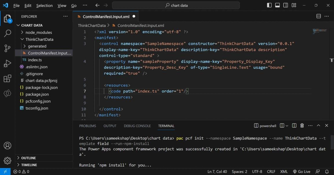
pac pcf init –namespace SampleNamespace –name ThinkChartData –template field –run-npm-install
Step 3: Edit the Control Manifest
The control manifest file defines metadata and configuration for the custom control, including properties, data sets, and resources. Customize the manifest file according to your project’s needs.
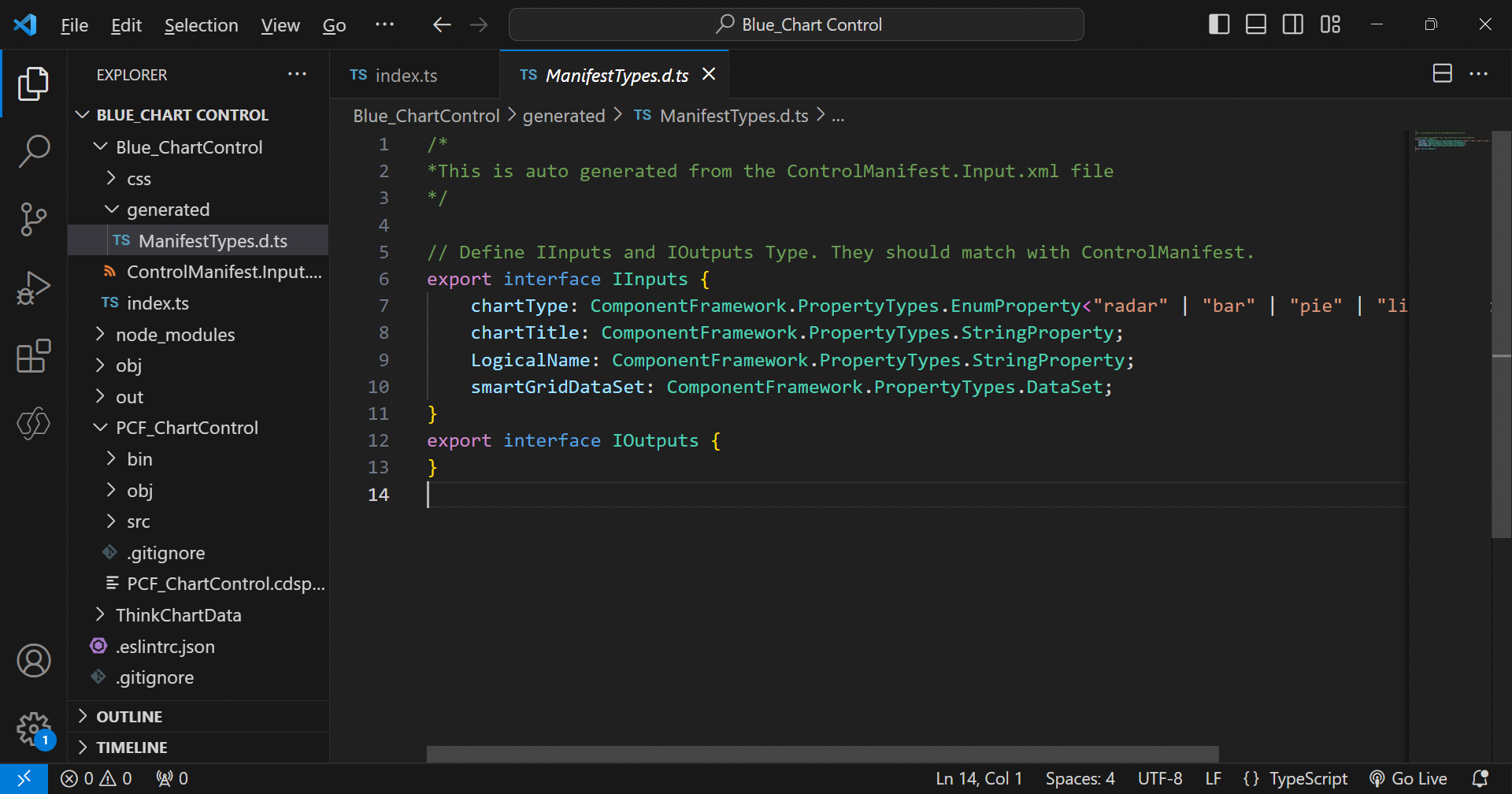
npm run refreshTypes run this command to generate ManifestDesignTypes.d.ts file.
Step 4: Implement Component Logic
In your PCF project’s index.ts file, you’ll implement the logic for your custom chart control. Here’s what you need to know about the key methods:
init: This method is called during control initialization and is responsible for setting up the initial state and rendering the chart container.
updateView: The updateView method updates the chart’s data and appearance based on changes in the context or data source.
renderChart: This method is responsible for rendering the chart itself within the designated container.
Step 5: Build and Debug Your Control
Build your PCF project using the npm run build command. You can also debug your control locally using the npm start watch command.
Step 6: Import Your Custom Control into PowerApps
To use your custom chart control in PowerApps:
-
Create a new solution project in the Power Platform.
-
Add a reference to the location where your custom component is located.
-
Build the solution using the dotnet build command.
-
Import your solution into PowerApps.

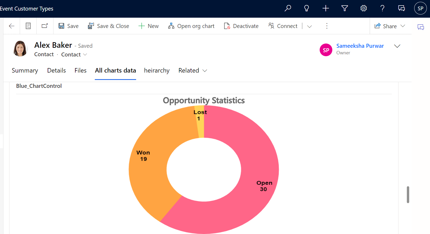
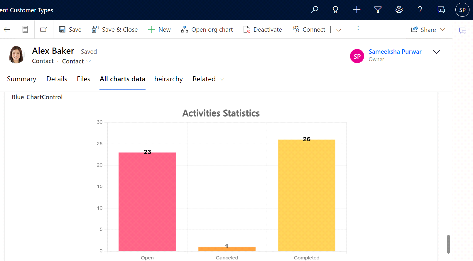
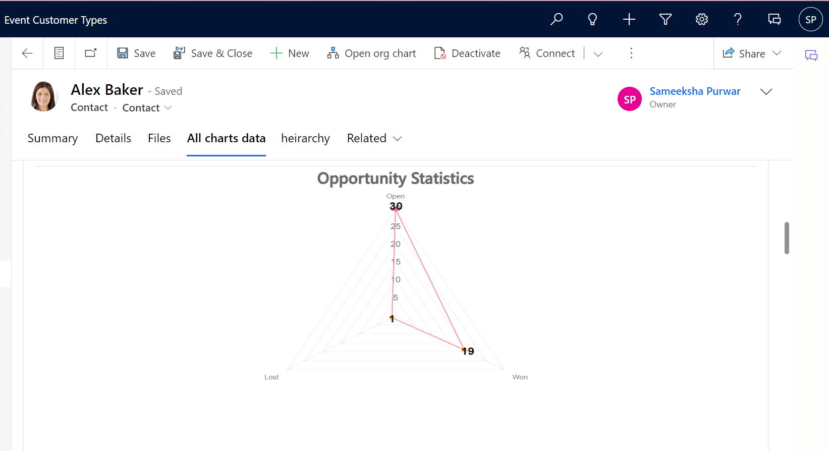
Output: Custom Chart Control in PowerApps
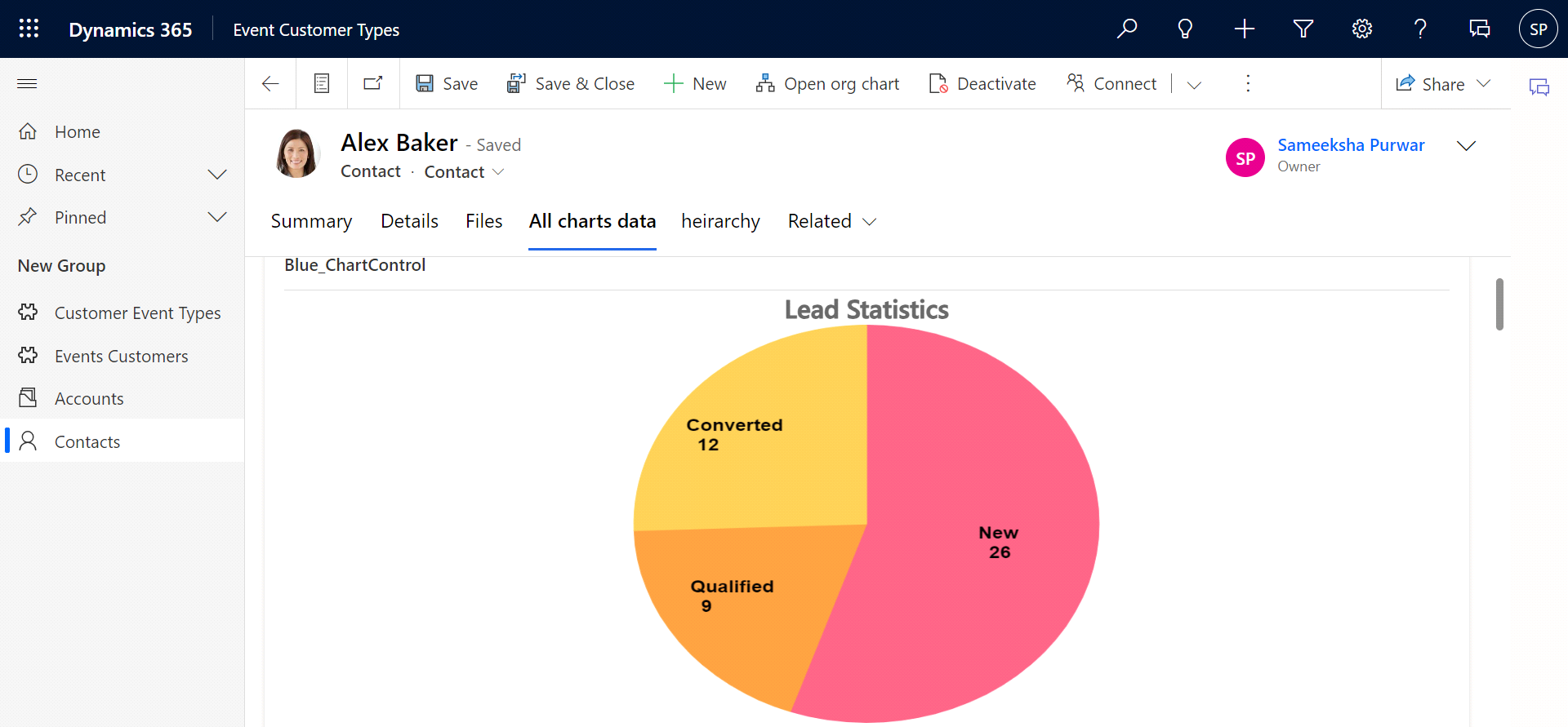
Once your custom chart control is imported into PowerApps, you can easily use it in your apps. Simply drag and drop the control onto a form, configure its properties, and start visualizing your data in a customized chart format.
What Does the Custom Chart Control Do?
The custom chart control you’ve created using PowerApps Component Framework (PCF) enables you to enhance the data visualization capabilities within your PowerApps applications. Here’s a breakdown of what this control does:
-
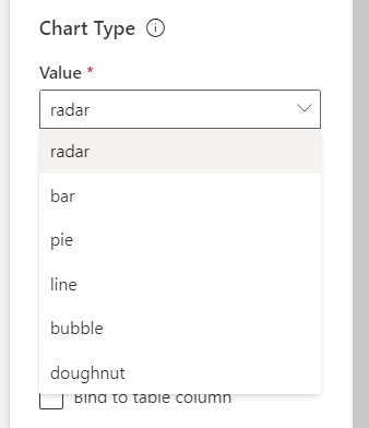
Custom Chart Creation: The control allows you to create custom charts, such as bar charts, line charts, pie charts, and more, that are not available as standard PowerApps controls.
-
Data Visualization: You can use this control to visualize data from your PowerApps data sources in a more visually appealing and informative way. This can be especially useful for summarizing and presenting data trends.
-
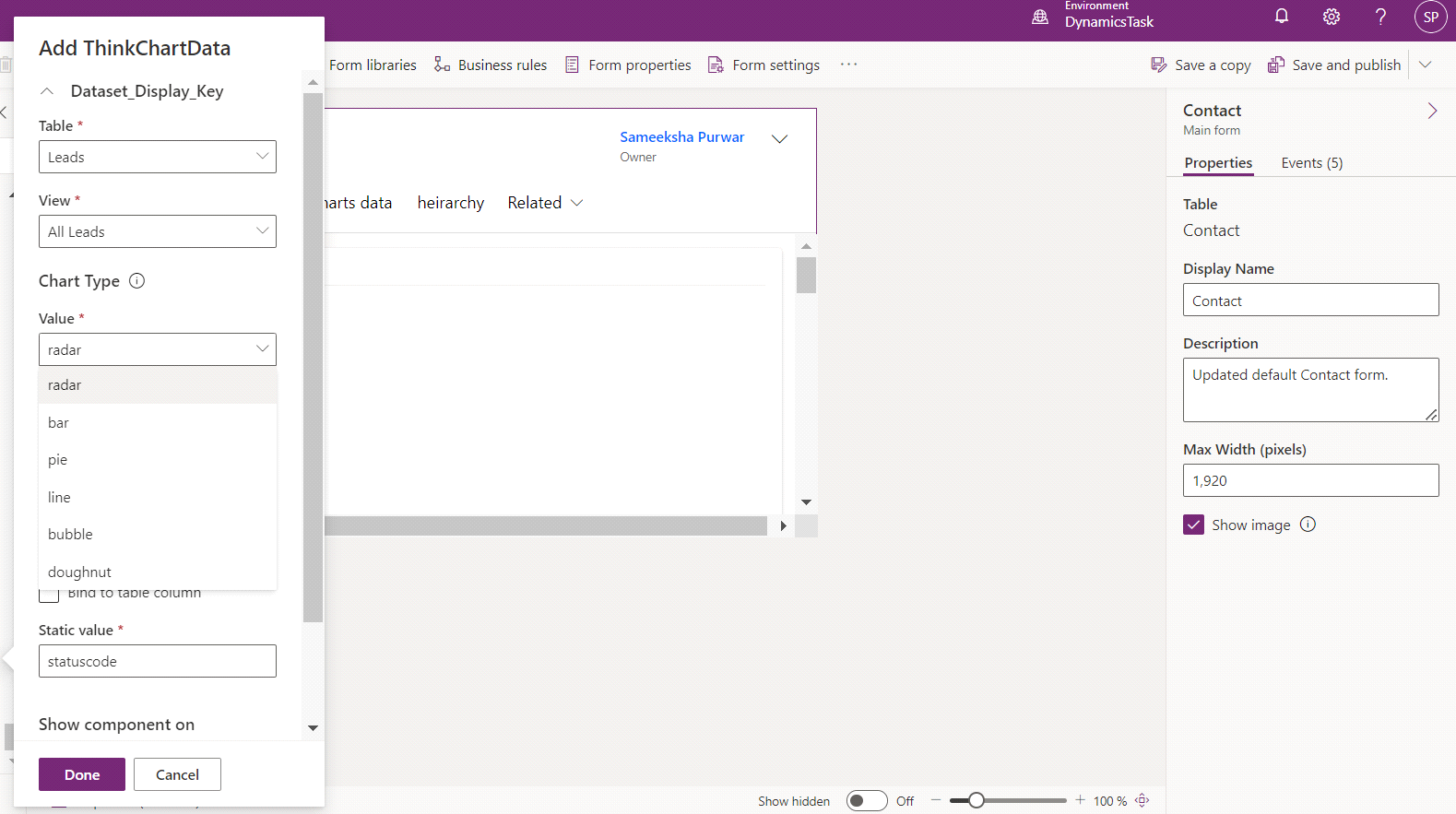
Chart Configuration: You have control over various chart configuration options, including the type of chart (e.g., bar, line, pie), chart title, colors, and other visual settings.
-
Dynamic Data: The control can dynamically update its chart data based on changes in the PowerApps context or data sources. This means that as your app’s data changes, the chart can automatically reflect those changes.
-
Data Labeling: The control supports data labeling, allowing you to add labels, values, and other annotations to your chart elements. This makes it easier for users to interpret the data.
-
User-Friendly Integration: You can easily integrate this custom chart control into your PowerApps forms and screens. Users can interact with the chart like any other PowerApps control, making it seamless to incorporate into your applications.
-
Customization: The control can be customized to match your app’s branding and style. You can adjust fonts, colors, and other visual elements to ensure consistency with your app’s design.
What Results Can You Expect?
When you use this custom chart control in your PowerApps applications, you can expect several benefits and results:
-
Improved Data Insights: Users can quickly grasp data trends and patterns, making it easier to make informed decisions.
-
Enhanced User Experience: Custom charts enhance the overall user experience within your PowerApps, making your applications more engaging and user-friendly.
-
Efficient Data Communication: Complex data can be simplified and communicated more efficiently through visualizations, reducing the need for extensive data analysis.
-
Interactive Data Exploration: Users can interact with the chart to explore data in more detail, such as clicking on segments of a pie chart or zooming in on specific data points in a line chart.
Increased App Value: By providing rich data visualization capabilities, your PowerApps become more valuable tools for users who rely on data-driven insights.
Conclusion
Creating custom charts in PowerApps using the PowerApps Component Framework allows you to enhance data visualization and user interaction in your apps. By following the steps outlined above, you can create and use custom chart controls tailored to your specific requirements without diving into the technical details of the code.
With custom chart controls, you can unlock new possibilities for data presentation and analysis in PowerApps, making your applications more powerful and user-friendly.


bluethinkinc_blog
2023-10-12